Website Features
Galleries, sliders, webp images and more!
A great collection of features to showcase the fantastic work of Jewell Construction.

Attractive design for showcasing quality
Galleries, sliders and filters
CloudCannon easy to use CMS
Accessible design and functionality
GDPR compliant
SEO optimized
Secure with remote backups to a repo
No regular pesky updates required
Form qualifies enquiry
Fast performance
Responsive images with webp support
Pendigital were very easy to work with. The site looks great, is fast to load and is already generating enquiries for us. Tim helped us throughout the process, making sure we understood all the different aspects of web design from planning it through to the options for managing the content and accessibility.
1. Demonstrating quality, demonstrating happy clients
Jewell Construction are a building firm located in Falmouth, Cornwall. They build and extend quality constructions across Cornwall. The directors needed a new website to:
- Showcase the quality they can achieve
- Communicate their strong track record and their friendly approach
- As a sales tool for using in meetings
- Highlight their very happy clients!
- Provide a deeper understanding of new enquiries
2. Component design
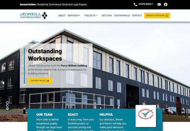
Our design needed to showcase the high quality that Jewell Construction produces. And to communicate the very high customer satisfaction levels that they achieve. The design needed a mixture of imagery, text and testimonials throughout all components… with their finished buildings front and centre. Of course!
The design also needed to align with their very unique (and existing) brand identity.
To achieve the above, we used:
- Heroes: with large images and bold statements. We didn’t want SEO to get in the way of the main message. I.e. ‘House builder Cornwall’ does not say as much as ‘Exceptional Quality…’. We styled key SEO tags with less emphasis than the core marketing message tags. This allowed us to meet SEO and marketing requirements at the same time.
- Testimonial components: Jewell Construction has lots of happy customers. And it was critical to show this. It’s so important in this industry to instil ‘peace of mind’. We developed bright testimonial blocks that have animations.
- Galleries: Photography of the finished buildings is key for showcasing expertise. Throughout we used a quick loading light-box to enlarge images. Some galleries have filtering so that visitors can filter residential or commercial projects.
- Core message intros: Customers need to absorb a small collection of critical messages. At times, this is unique to each service. For example, the important of the team, hands-on directors and more. Each service has a special intro message block to communicate these points.
- Strong calls to action banners: Throughout there are marketing banners with the core message. And a consistent call to action.
3. As a sales tool
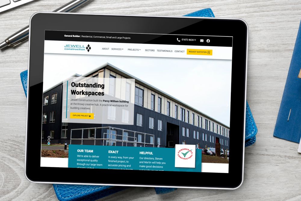
The new site is an excellent sales tool for face-to-face and virtual meetings. The directors plan to use the site on an iPad in meetings. This is so that they can navigate direct to examples. And to use the galleries to showcase specific quality aspects.
4. Deeper understanding of enquiries
We all need to qualify our enquiries so that we can focus on the most important. The quote form on the site allows the directors to understand more about where the client is in the total process of getting a new building.
5. Accessible
All our sites our built to meet at least WCAG AA conformance. This ensures that the site is easy to use by those who have a disability. It’s a core aspect of web design, but sadly ignored by many web designers. To support compliance we used the following techniques:
- Breadcrumbs
- Skip to main content
- Adequate font sizes and colour contrasts
- ARIA tags used where necessary
- Semantic HTML tags used throughout
- Outlines for supporting navigation by keyboard
- And more…
6. SEO friendly and fast too
The site didn’t need to be SEO friendly, it wasn’t a critical aspect of the build. But I can’t help myself! I implemented everything to boost their rankings in Google. From canonical tags through to optimized titles and meta descriptions.
The site is fast too, we’ve minimized the code used. And we have used a static site generator to ensure that the site is fast ‘out-of-the-box’. Read more about SSGs here.
7. Secure with no updates needed
We built the site using a static site generator, you don’t need the level of updates in comparison with WordPress. We’re talking updates every couple of years vs updates each month. And we back-up all edits to a remote repository.
It’s important to note that with an SSG, your content is not locked away inside a database. All your content is in markdown files, these are like Word documents. So saving and moving content around is very easy.
8. And with a great content management system...
We’ve used the CloudCannon content management system. It has a great user interface. And since it is ‘content management as a service’ then it is free of updates. It’s great - please check it out!
9. GDPR Management
For all sites in the EU and the UK we need to ensure that the site meets GDPR compliance. I.e. the General Data Protection Regulation. We use a Cookiebot implementation to ensure the site is compliant.
9. Read the 5/5 review
You can read the 5 out of 5 review here.
Thank you to Jewell Construction for the above review and for being great clients.


