Project Features
Easy to use web app admin system for Wylder
Google’s Angular web development framework was perfect for building the administration system for the Wylder app.

Authentication with guarding
Tracks reported posts with ‘live’ data stream
View users and their posts
Search users and daily challenges
Dashboard with instant snapshot of key metrics
Video player
Block posts
Block users
Delete users
Content management of daily challenges
Content management of challenge bank
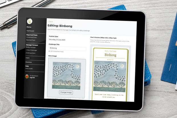
Card ‘live’ preview
Style cards with palettes
Strong validation
Drag and drop image uploader
Badge reward management
Benefits from a serverless Firebase backend
Help section
The Wylder admin web app is their goto system for managing all the app's content and any issues with users. We built the system for use via a web browser so that the Wylder team would be able to access it from anywhere. Whether on desktop, tablet or mobile, the Wylder team are only a login step away from managing their app.
User generated content
With user-generated content then it's essential that there are admin tools in place for dealing with errant users. A reported post needs reviewing and blocking if it's breaking the Wylder rules. And any offender that keeps posting inappropriate content will need total blocking from the app.
In fact, it's an essential rule from the App Store and Google Play. For example: App Store rules that there must be a method for filtering objectionable content. And an ability to block abusive users, plus more. Check out the App Store Review Guidelines. And here are Google Play’s.
Google Play User Generated Content Guidelines
We took all the above into consideration when building the web app admin system. Wylder have all the tools they need at their disposal, including:
- Searching for and viewing users
- Viewing reported content
- Blocking posts
- Saving comments about blocked posts
- Blocking users
- Deleting users
Easy content creation
Creating content for the Wylder App is very easy via the admin system. It has some really great features such as:
- A preview pane of the challenge cards - dynamically updated as content is added. Designed to mirror the actual card in-app on an Android Pixel phone.
- A drag and drop image uploader (or use a button!)
- Validation warnings to constrain text limits and image sizes - validating as you type. Ensuring that the app always has optimized content.
- Textfield length 'live' updates
- Options to re-order and delete content
- A wide selection of colour palettes to style challenge cards
- Adding advert banners and links
- Clear styling and labeling so that the Wylder team knows what and where they're editing.
- Guards to ensure that any unsaved content isn't lost when navigating away
Help section
We included a dedicated help section for the admin, inside of the admin. It provides links to Google docs for advice and tips on using the system. Plus, specific advice on aspects such as sending a push notification through the cloud messaging system.
With every system that we build, we always look at providing short-cut guides for any challenging aspects. We understand that even if a system is super-intuitive a few weeks away from it can lead to gaps in knowledge. And then this will lead to problems when entering data etc.
Tools: Angular web development framework
For any web app, our tool of choice is always Angular. A web app is a website that feels like a bit of software... there's no refreshing of pages. Check out our Knowledge > Web articles > Exploring progressive web apps article to find out more.
As the Wylder system is a web app then navigating to a new page is instant (no refreshing). Updating content on a challenge card happens as you're typing. And validation rules are checking your text as you write. It's great to see it in action.
A bit more about Angular if you're interested...
Angular is a strongly opinionated web development framework - and we love it because of this. What does this mean? It means there's only one way of doing something in Angular. For example, navigating pages. With another framework system like React, then you're allowed to use multiple navigation tools. They say, if you've seen one Angular app then you've seen them all. And if you've seen one React app then you've only seen one React app!
Like Flutter, Angular is another tool owned and managed by Google. And so that also provides peace of mind for us... Google uses Angular for a great deal of its own online systems and so it's a priority for the tech-giant.
We've looked at tools like React, Vue and Svelte but they just don't have the one-stop-shop aspect that Angular provides.
If you're a web dev reading this article and you're thinking about a new web framework then make sure you check out Angular. The Google team managing it is adding all kinds of super-cool features in every new release.
Tools: Others used
We also used a selection of other tools when building this web app. For its design we used the Pinegrow web editor. With some 30 years plus of coding experience between us naturally we can code manually. But Pinegrow just speeds it up. It's another goto choice for us. If we're quicker then our clients benefit!
With Pinegrow we used Bootstrap 5 to style each of the admin's components. Bootstrap 5 is great... lots of styling options straight out of the box. When combined with Pinegrow it makes life even easier!
Within the Angular app we also used RxJS to help us manage the asynchronous aspects of the app. And finally the app sits on Firebase. It's easy to update via the Firebase cli.


